top of page

visual identity

rebranding - stepstone.de job portal

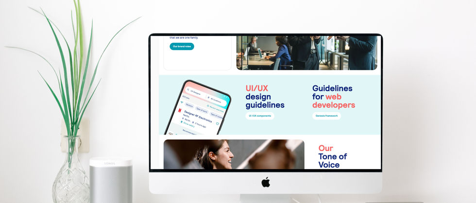
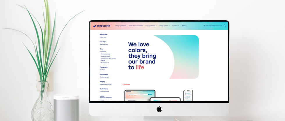
Creating design guidelines for two new visual identities


I collaborated closely with the Creative Director to build comprehensive brand management systems for two newly developed visual identities. This included designing a wide range of templates and establishing clear, practical guidelines for consistent brand application across various touchpoints—from digital to print. To ensure easy access and company-wide alignment, I implemented both design systems using Frontify, making them fully accessible to all employees and teams. This not only streamlined internal workflows but also strengthened brand consistency across global communications.

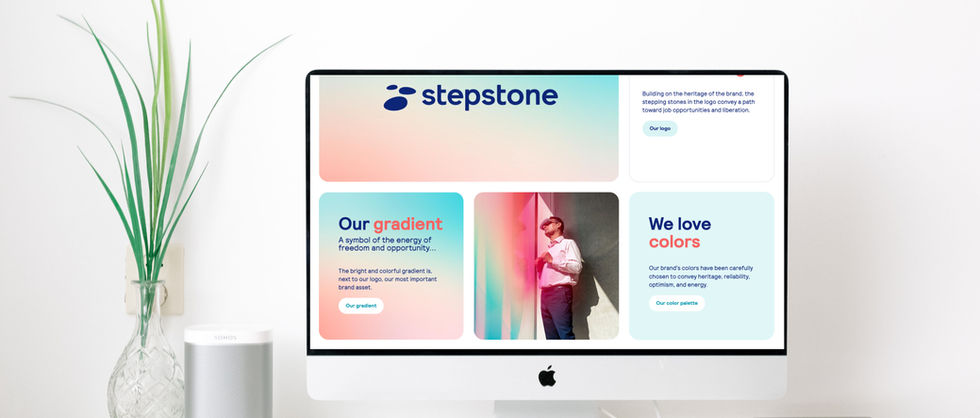
rebranding - the Stepstone Group
bringing new brands to life

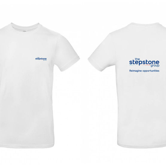
As part of the new brand promotion phase, I worked closely with the Creative Director to further evolve and activate the visual identities across multiple channels. I developed versatile brand applications, designed templates, and created a wide range of assets for social media, merchandise, outdoor advertising, and print. My focus was on ensuring visual consistency while adapting the brand for real-world use—enhancing recognition, engagement, and impact across every touchpoint.

living with lung cancer campaign 

Project Overview

This project focused on developing a unique and empathetic visual identity for a healthcare awareness campaign aimed at supporting individuals living with lung cancer.

Challenge

To create a brand that communicates trust, compassion, and clarity—without losing the sense of professionalism expected in healthcare communication.

Approach

I designed a thoughtful color palette using lavender (widely associated with cancer awareness) and white (symbolizing lung cancer specifically). Typography played a key role: I combined clean, geometric fonts to maintain professionalism with handwritten type to introduce a human, emotional element.

Custom Icon Design

To support the visual identity, I created a set of hand-drawn icons that aligned seamlessly with the logo and overall tone. These included:

  • Connected hands – symbolizing support and empathy

  • Tree – representing growth and resilience

  • Heart – conveying care and compassion

These visuals were intentionally organic and illustrative to add a personal, hopeful touch to the campaign.

Outcome

The final design was a cohesive, approachable visual system that helped build emotional connection while maintaining clarity and professionalism. The campaign materials successfully conveyed a message of hope, understanding, and support for those affected by lung cancer.

bottom of page